TAMS Revolution: Redefining the RFP
Project Overview
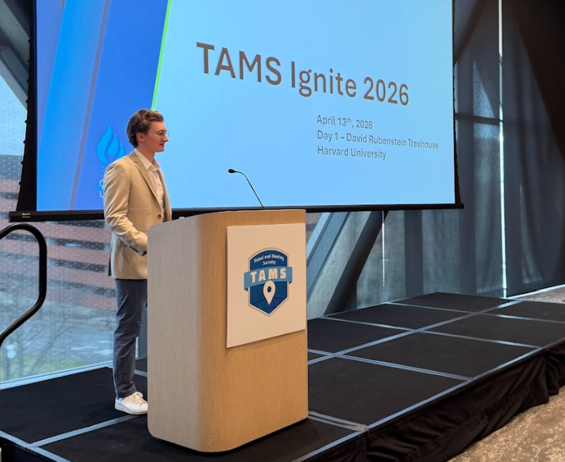
In partnership with TAMS (Travel and Meeting Society), our 6-person team developed TAMS Revolution, a functional AI-driven demo designed to modernize the legacy Request for Proposal (RFP) process. Working alongside industry leadership, we built a proof-of-concept to showcase how AI agents can replace 30-year-old manual workflows with intelligent, automated systems. This work culminated in a featured presentation and live demo sessions at TAMS Ignite 2026 at Harvard University.
My Role: Lead UX/UI Designer
• End-to-End Design Ownership: Executed 100% of the visual and interface design, developing dual-sided prototypes in Figma for both Hotel Buyers and Suppliers to ensure a seamless ecosystem.
• UX Research & Jargon Translation: Co-led user research with one design teammate, successfully translating dense, complex business travel lingo into an intuitive, accessible user interface.
• Cross-Functional Alignment: Partnered closely with the other project groups to bridge the gap between complex AI logic, financial requirements, and evolving stakeholder needs.
• High-Fidelity Prototyping: Leveraged Figma to rapidly generate interactive, data-rich prototypes tailored for high-stakes live demonstrations.
• Backend UI Retrofitting: Redesigned the functional backend UI to ensure visual consistency between the technical engineering demo and the high-fidelity product vision.
High-Velocity Prototyping & Iteration
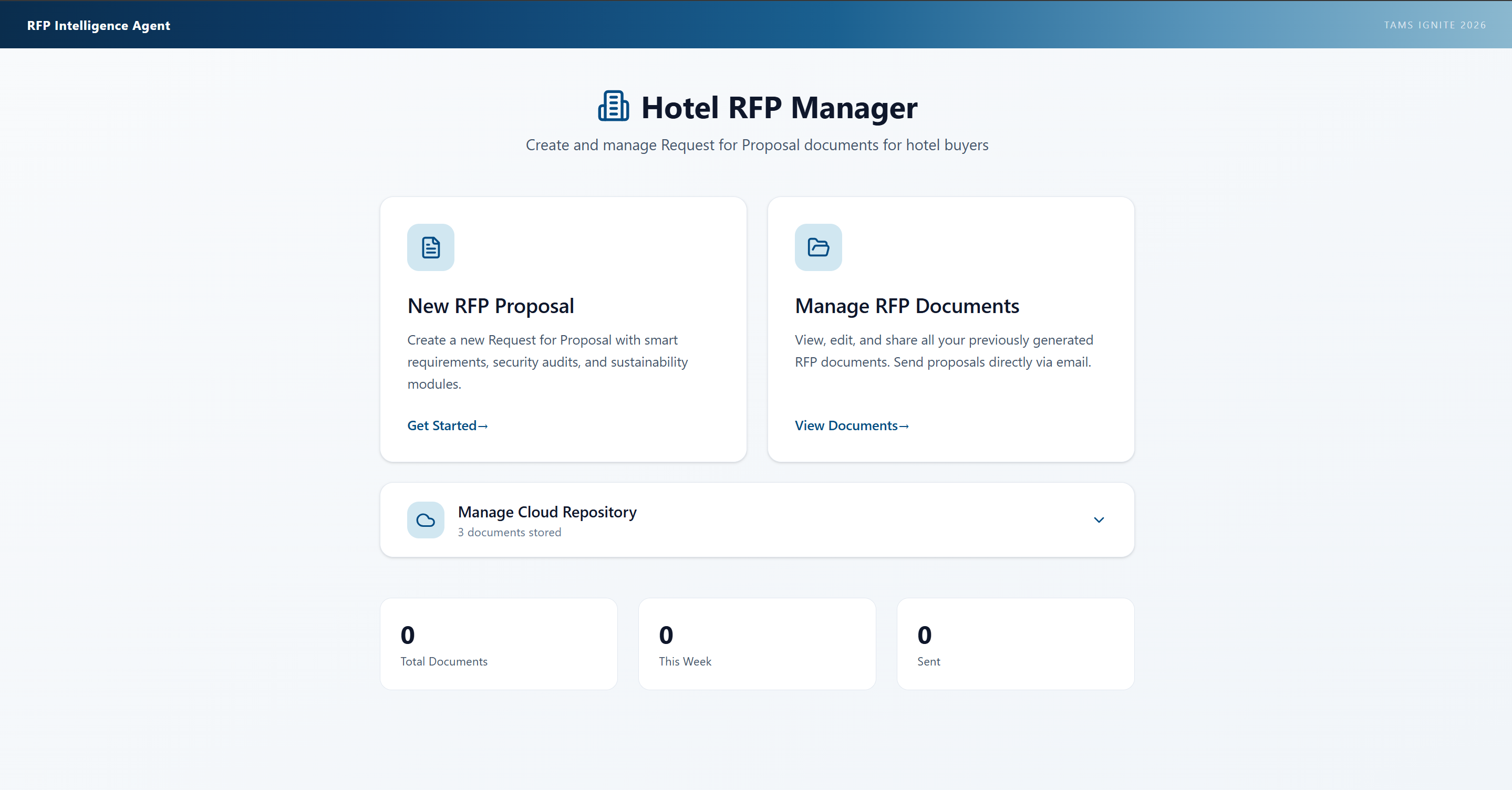
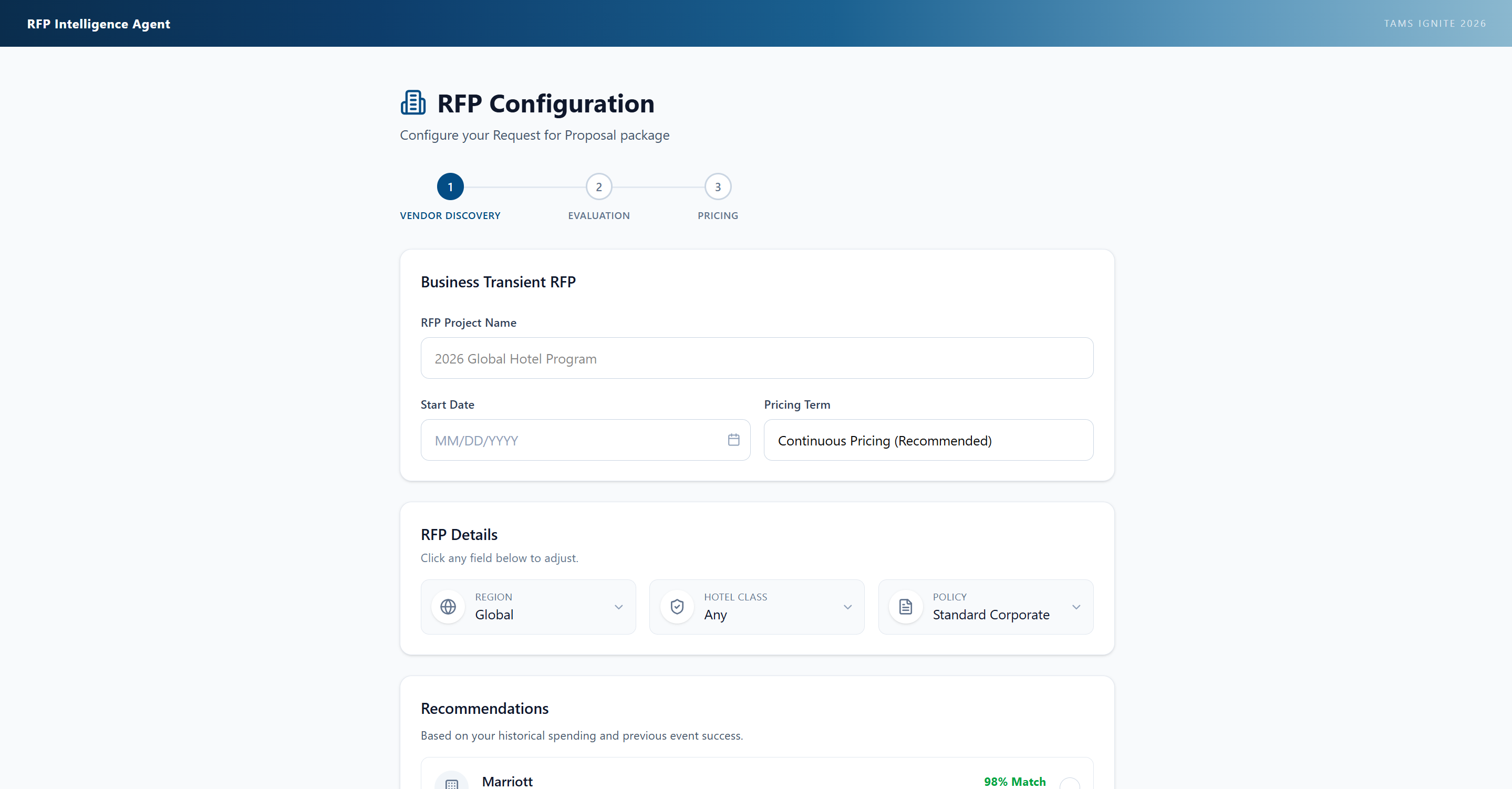
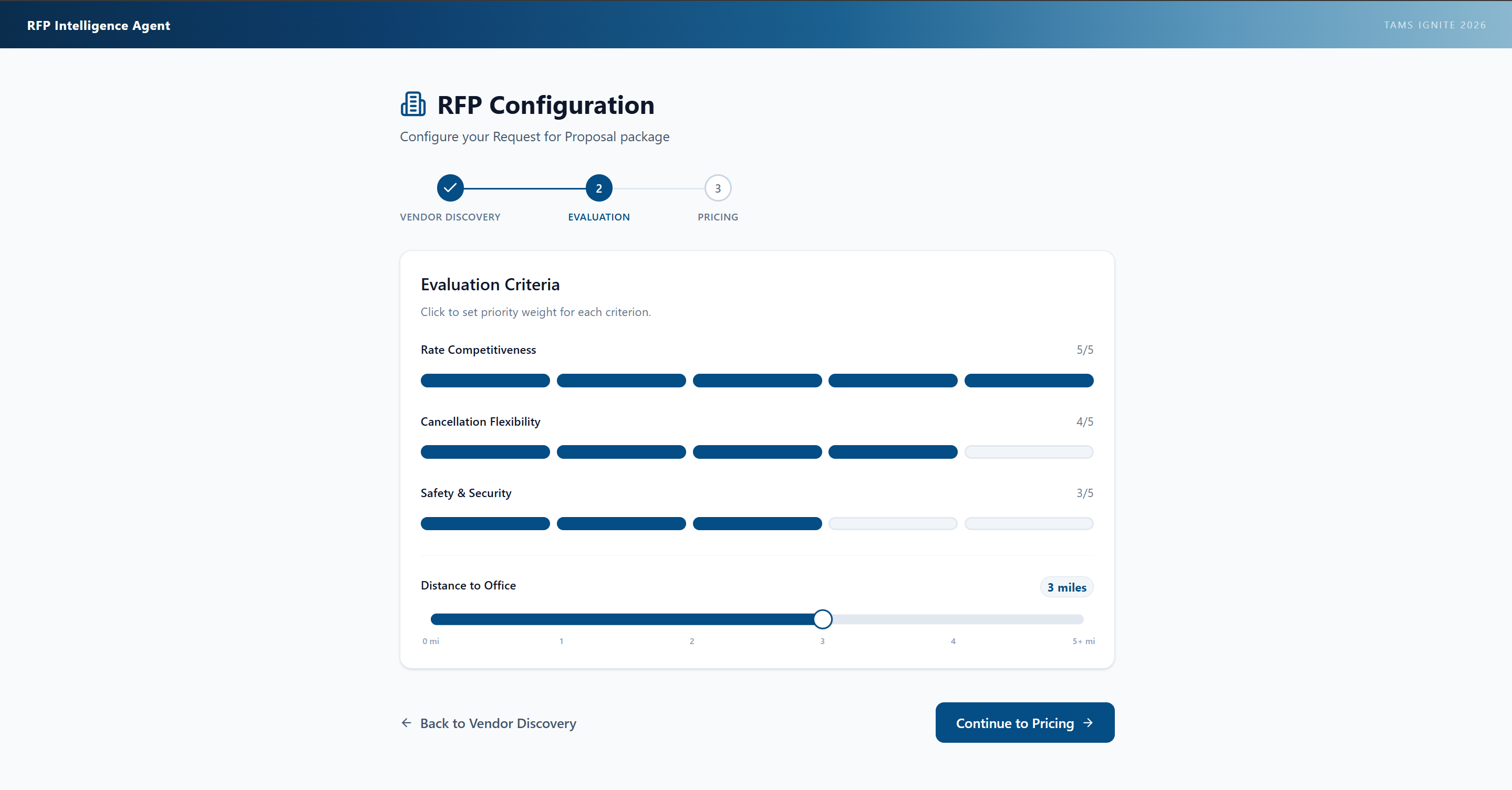
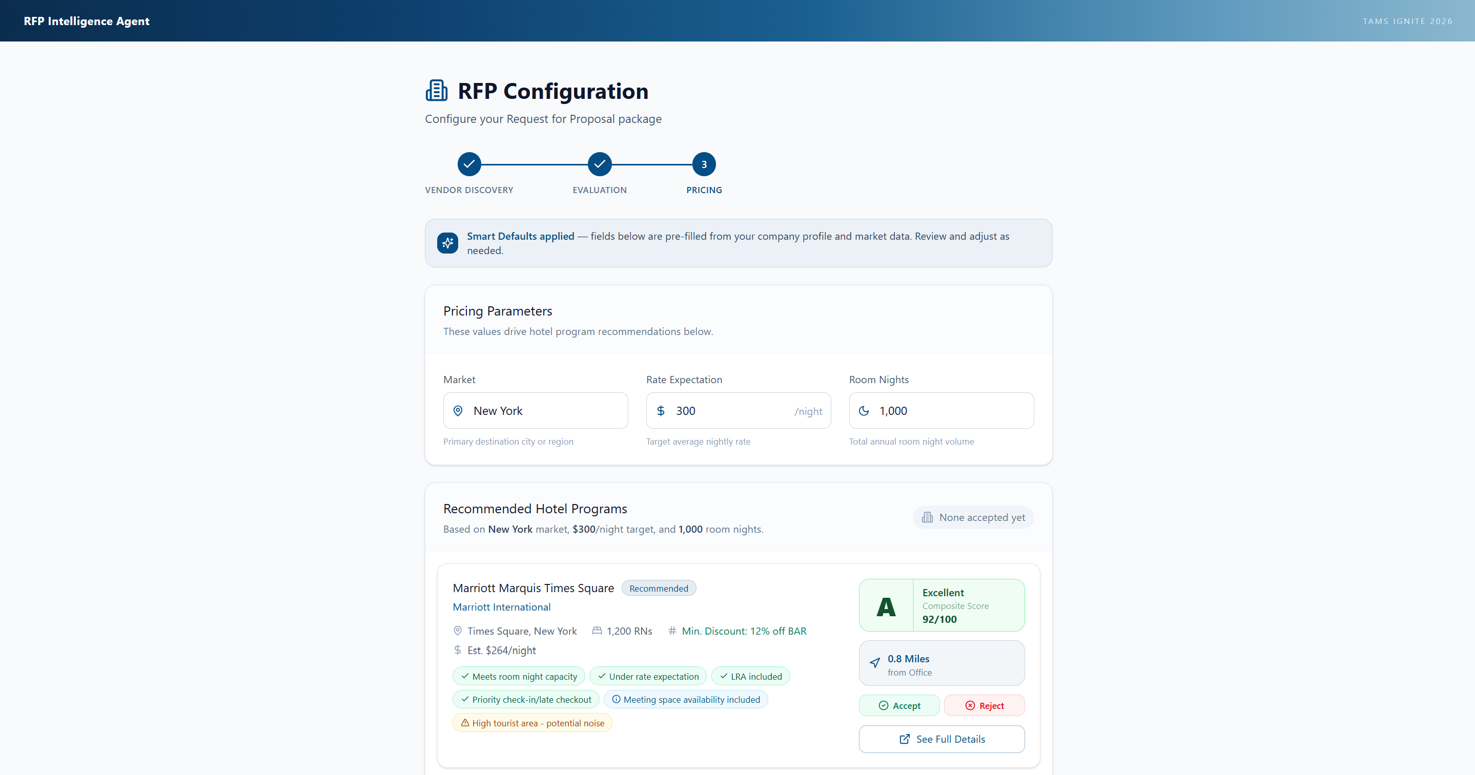
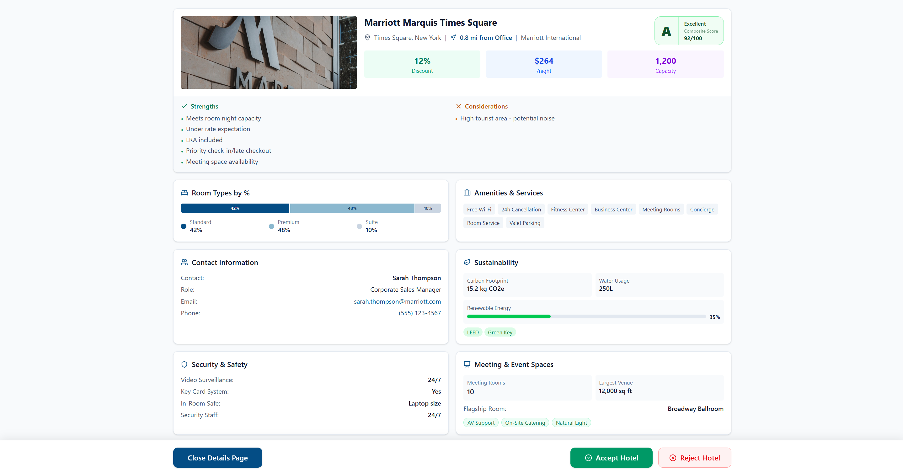
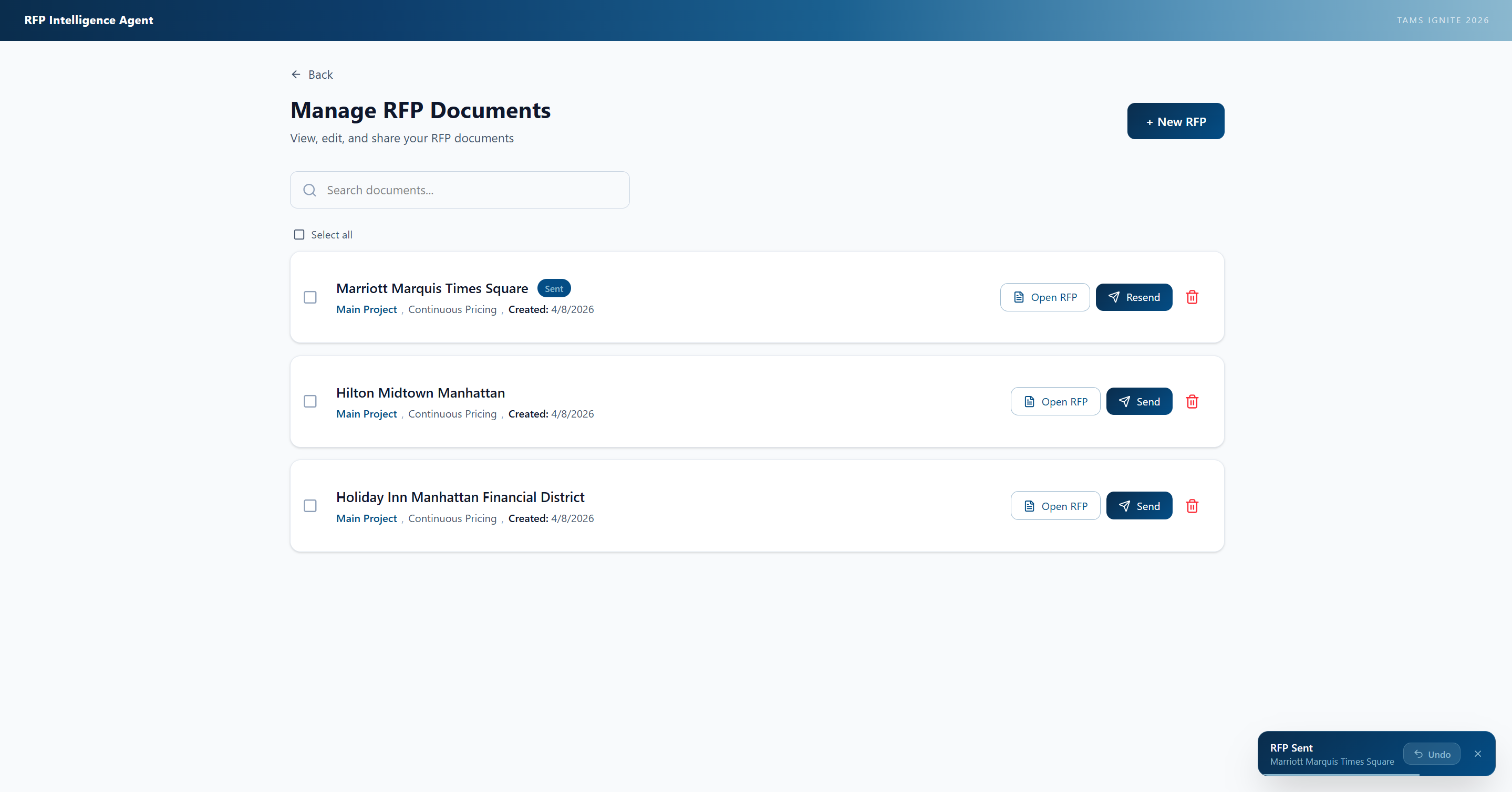
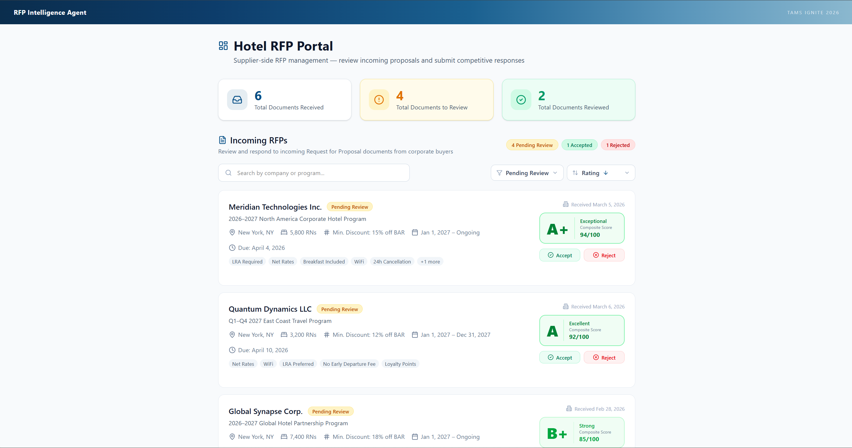
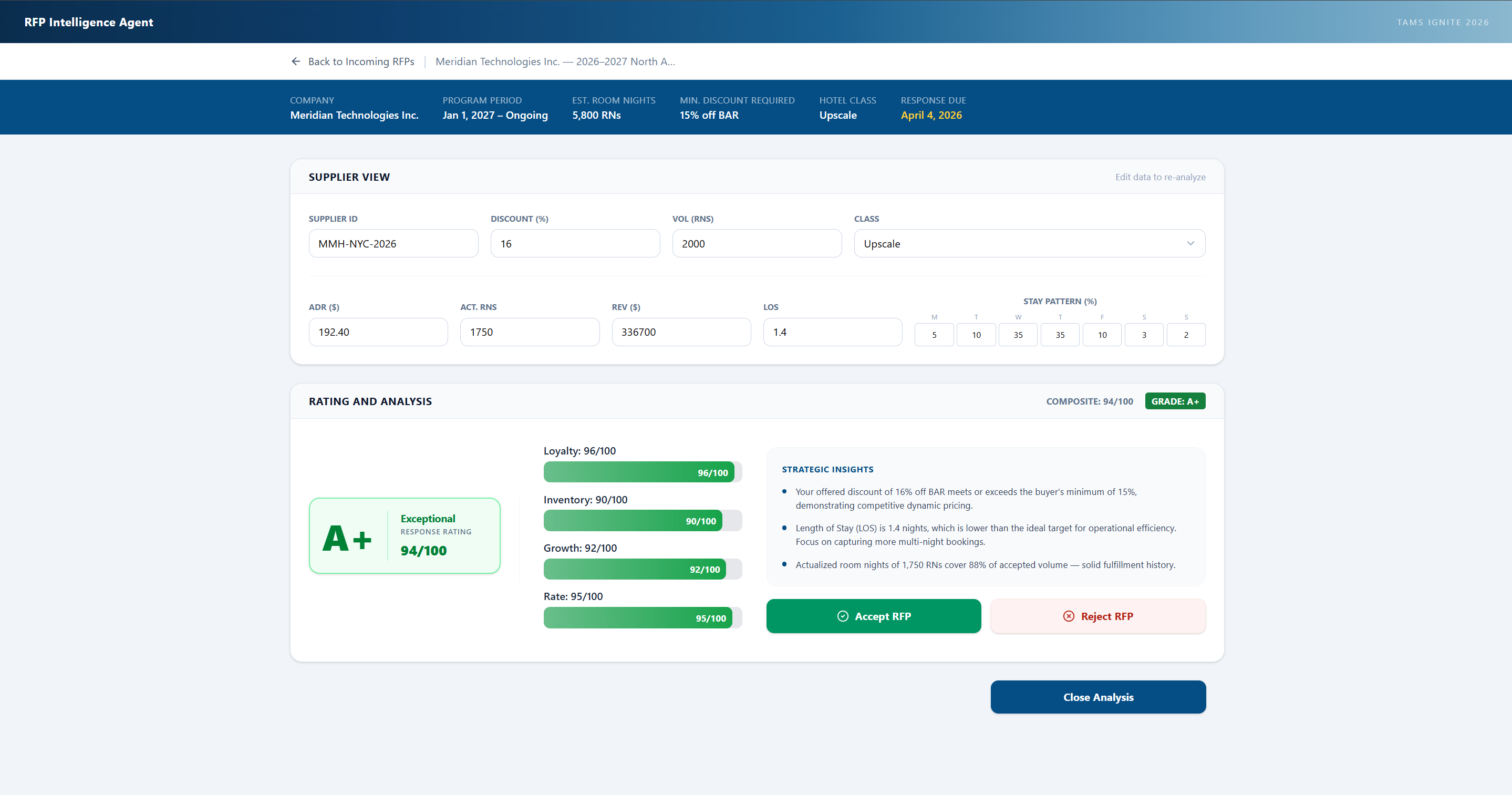
Screenshots of the buyer/supplier side demo.
Our team adopted a high-velocity iterative design cycle to hit a strict conference deadline. We navigated evolving business requirements to build a fully functional frontend prototype in just 6 weeks, dedicating an additional 2 weeks to rigorous refinement and presentation prep. By building quick, functional versions of the interface and gathering immediate feedback, we were able to reach the "sweet spot" for user experience much faster than traditional cycles. I utilized Figma to populate these prototypes with realistic data, which was crucial for our Harvard debut.
Requirements Gathering & Cross-Team Coordination
A major challenge of this project was navigating the complex requirements gathering process within a highly specialized sector. I had to rapidly learn dense corporate travel lingo, nuanced pricing terms, and specific business logic to ensure our AI interface was truly functional for industry veterans. Additionally, I was responsible for coordinating these evolving requirements, ensuring that the interface design aligned seamlessly with the overarching goals and technical constraints of all participating teams prior to our live deployment.
Conference Outcome & Live Demo
Live demo recording—the same demo we used at the Harvard presentation.
The "TAMS Revolution" project was introduced on the main stage at Harvard University during a 15-minute featured session. I co-presented the frontend product vision alongside my design teammate for 8 minutes, which was followed by a 7 minute presentation from the backend team. Afterward, we transitioned to immersive breakout rooms where I hosted 4-minute live, interactive demos for industry executives.
Project Assets
Explore the figma demos and the presentation slides used at the Tams Ignite Presentation
